The Case for Mobile Optimization
Last week we defined mobile optimization for you and talked about what’s involved in creating a mobile optimized website. Today, we’re going to finish up that discussion by giving you all the reasons why you should care if your site is mobile friendly or not. We grabbed a couple of screenshots for you to illustrate what we mean, and we gathered a few statistics to put some real numbers out there. By the end of this post, you’ll be calling us. Operators are standing by!
Prettyful pictures (and some not so prettyful pictures…)
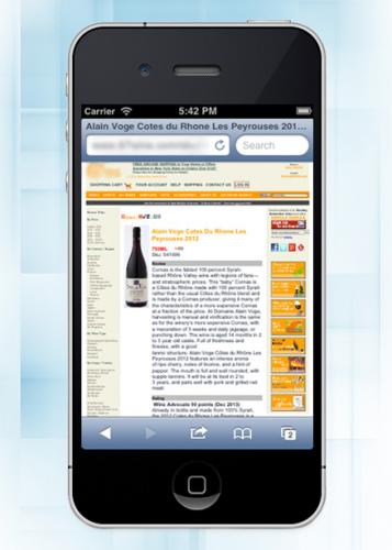
This first example is NOT a mobile optimized e-commerce site. You can see how tiny everything appears on the screen and if you’ve ever tried to navigate around to shop on a site like this, you know how incredibly hard it is to click on things. Suddenly you have the fingers of a sasquatch and can’t seem to select the right thing! Forget this site! There must be a better one out there!

This next example demonstrates what a mobile optimized site looks like. It’s very clean, the typeface is large and easy to read and it’s very simple to navigate around and select what you need. This is what we’re looking for. People like an easy experience and this site provides just that.

Some numbers to keep it real
Now that you see the difference between a mobile friendly website and one that is not, let’s add a few numbers to our discussion. We’ve selected a random client’s e-commerce website that does not currently use a mobile optimized layout to talk about. This website is typical and has very similar analytics results to several others we looked at.
Using a website analytics tool such as Google Analytics, we can see how this website is performing for visitors who are accessing it via a mobile or tablet device. This way, we can see if it would be beneficial for this site to become mobile friendly.
Google Analytics is a free online web service offered by Google that helps website owners view statistics on their website's traffic. With Google Analytics you can see the number of visits you get, the average visit duration, your bounce rate, devices used to access the website, and a number of other statistics that can demonstrate how people are accessing and using your site.
For this particular site, let’s look at the analytics for a period of 30 days. During this period, 59.57% of the visitors accessed the website using a desktop device. That accounted for the majority of website traffic. The remaining 40.43% of traffic were visitors navigating the website using a mobile or tablet device.
Visitors viewing the site on a smartphone totaled 21.63% of visits. Tablet devices clocked in at a total of 18.8% of the traffic during this period. Analyzing this data, it is clear that this particular website receives a significant amount of traffic from visitors using mobile devices.
The average visit duration for the website was 1 minute and 41 seconds during this period. Desktop users spent an average of 1 minute and 36 seconds on the website. Visitors from mobile and tablet stayed on the website an average of 1 minute and 33 seconds and 2 minutes and 5 seconds respectively. Viewing these statistics, this data demonstrates that visitors spent a comparable amount of time on the website with all of these different devices.
However, the average bounce rate for this website during this one month period was 37.50%. A site's "bounce rate" is defined as the percentage of single-page visits. This can also be defined through the scenario of a person leaving your website from the entrance page without clicking anything on the page. For desktop visitors, the bounce rate was at an average of 35.77%. Analyzing the mobile statistics, the bounce rate was higher on smartphones with an average bounce rate of 50.75%. The average bounce rate on tablet was on the lower end at a rate of 27.75%.
For this website, so far in 2014 40% of visitors were using mobile devices. That’s nearly half! What’s scary is that even though so many people were coming to the site, the bounce rate for mobile users was very high. In fact, it was over 15% higher than the bounce rate for desktop users.
This means that even though many customers are visiting the site from a mobile device, they leave right away without interacting with it because it’s not mobile friendly and the user experience frustrating.
Some websites, particularly e-commerce websites, can be pretty large with lots to click on and navigate through. On a mobile device, that can be a super frustrating and time consuming experience. A mobile optimized layout like the example we provided above creates a user-friendly alternative and makes their shopping experience a pleasant one.
You deserve to have a successful website. Treat yourself and your customers to a mobile friendly experience!

 An agency-eye view of Marketing, Advertising, Branding, Design & Media.
It might be good to see the same site as is and optimized. Two different sites have distinct differences, especially retail sites like Target.
Use the first (not mobile optimized) and show us how it would look when optimized.
Also, is this a complete redesign of the current site, is it a responsive design or is it two sites that the device points to when it detects a device.
You left out a great deal of information that will confuse most that have not worked with these types of projects.
Dear Anonymous,
You make good points, but this post is only meant to start a conversation and not be an exhaustive explanation of mobile optimization. As you know, this topic can be vastly complicated and far too big to cover everything in just one or two blog posts.
Thanks for reading and commenting!