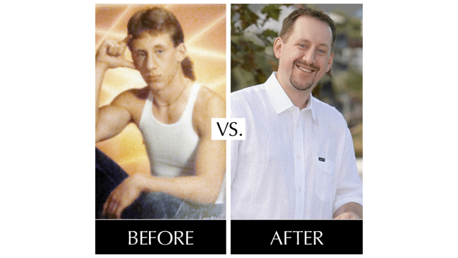
Is Your Website Still Sporting a Mullet?
Is your website starting to look like it was born in the 90’s? WAS your website born in the 90’s? If so, it’s definitely time to start thinking about a redesign. You didn’t think that site you had designed a millionty years ago was going to work for you forever, did you?
Every business that has any kind of web presence will need to update their website every few years to stay current with trends and new technology. The nature of your business may have evolved over the years, or your old design might be a little outdated. Think of it as being like changing your hairstyle every once in a while. Nobody should still be sporting a badass ‘87 mullet, for example. What was once awesome (arguably, mullets were never awesome but that’s beside the point) does not always stay awesome.
But before you call us, you need to get your ideas together first since redesigning your website can involve a lot of decision making. Today, we bring you a list of some of the things we’re going to talk to you about when you come to meet with us. Consider it a cheat sheet to make you super smart and savvy.
It’s good to be prepared, GLAD WORKS friends.
1. What are your goals for your new website?
Ask yourself what you want to accomplish with this redesign. Do you want better functionality, better design, improved SEO? Do you need new content that includes new services or products? You need to have clear goals as they will be what drives the whole project.
2. What does and doesn’t work about your existing site?
Go through your site and approach it from a user’s perspective. What works? What doesn’t work? Is it user friendly? There are bound to be some elements of your site that work really well and some that don’t. For example, you might have a totally rockin’ photo gallery that people enjoy looking through…IF they can find it. In that case, you want to keep that gallery, but make it easier to find. Keep looking back at your goals as you go through your site to make sure you have a clear picture of what’s going to help you meet them and what’s not. Try not to be emotionally attached to things. If they’re not working, no matter how cool you think they are, they have to go. Sorry.
3. Has your brand evolved since your last website?
Brands change over time. Maybe you’ve expanded your services and products, or maybe your image has changed a bit since you first set out. Now is the time to think about where you are today compared to when you last had your site designed. What has changed about you and how should your new site reflect that? You may be looking at a total re-branding, and now is the time to do it—a whole new you complete with a shiny new website! BAM! Check you out!
4. Are you still loving your color scheme and logo?
If your brand has changed, the image you want to project has probably changed too. That image is projected through the colors you choose and your logo (among other things). Maybe your logo just needs to be tweaked a little bit, or maybe your color scheme needs to reflect your new identity. Look back to your goals as you ponder aesthetics.
5. How is your site being used?
Are your customers mostly accessing your site from their phones? If that’s the case, you need to think about making your new design responsive. Do your customers like to interact with certain elements of your site? You might want to consider gamification to keep them coming back to you. Study your site analytics to help you understand how visitors are finding you and what they’re doing once they get there. This will give you a clear picture of how people are interacting with your site and what changes you need to make to enhance their experience. If you have no clue how to get site analytics, we can do that for you and help you interpret the results. No worries.
There are many other things to think about too, but these are a few of the big ones to help you get started. Remember that making the transition from the old site to the new one might be off-putting to some people, so you might want to include a blurb somewhere explaining that you’ve improved your site and encourage them to check out your new look!

 An agency-eye view of Marketing, Advertising, Branding, Design & Media.