The Anatomy of a Website: Not Nearly as Gross as Biology Class
In an effort to let you into our wild, wacky (but not too wacky), wonderful GLAD WORKS world, we’ve got a fun series for you! Ready?
It’s about the Anatomy of a Website.
That’s right, GLAD WORKS friends! We’re gonna get elbow deep into the innards of a website. From the very bare bones and structures to some of the bigger parts, we’re going to explain it all. By the time you’re done reading this series, you’ll be able to dissect a website and identify all its parts and pieces. And when you come to us to design one for you, you’ll be able to talk about it like a pro.
So snap on your latex gloves, grab your scalpel and let’s dig in.
(Don’t worry. You won’t get anything gross on your outfit…)
Sitemaps
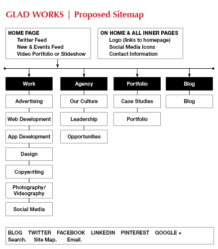
Great website designs begin here. From simple to complex, every website we create starts with a sitemap. In the context we’re talking about today, a sitemap is a visual description of the navigational structure of a website. When you come to meet with us to talk about your website design, we will make frequent mention of getting a sitemap together. A sitemap is a way for us to put down on paper all of the pages that you want your website to have. We then take your list of pages and organize them hierarchically so that your website will have a logical navigational structure when it’s done. The sitemap is the first line of protection against a confusing and convoluted user experience. Think of it as a blueprint.
A sitemap looks like this:

Notice how it looks a lot like a flowchart and that things are logically placed in categories and subcategories so that information flows from one thing to the next.
We should also mention to you that a sitemap can also be a simple XML file (a machine-readable markup language) that lists the pages on your website for search engines. Creating this kind of sitemap helps search engines like Google know about all the pages on your site. But this is not the kind of sitemap you have to worry about at all. That’s our job.
Wireframes
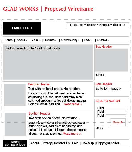
Once the sitemap is finalized, it’s time to move on to wireframes. Wireframes are pretty plain and boring looking and do a lot of the same things as sitemaps. The difference is that while the sitemap only shows us the information architecture, the wireframe goes one step further and links that thinking to the visual design. In other words, wireframes depict the possible page layout plus how the interface elements (things like windows, buttons and icons) and navigation (the way users get around the site) work together.
Here’s what a wireframe looks like:

You might see one of these when we design your website so that we can be sure that everything is placed in a way that makes sense to you before we move ahead to the design stage. Wireframes can also be helpful to look at when you’re trying to decide how your information should be organized visually on a webpage. There’s a lot you can do and tons of different ways you can lay stuff out.
Next week we’re going to move on to what each part of a webpage is called so that when you see a wireframe, you’ll know what to call things. While we certainly don’t want to make you feel like you have to know how this works in order to communicate with us, we do think it’s fun to learn about and that it will help the design process go more smoothly for you. Stay tuned next week as we go a little deeper.

 An agency-eye view of Marketing, Advertising, Branding, Design & Media.
I'm a flash web designer and I don't rellay have much of a process, I usually ask my client to give me a list of at least 5 website that they enjoy visually and I try to come up with my idea based on that.Do any of you have a specific process to come up with an eye-catching and visually pleasing web site design in adobe photoshop?