Deep Thoughts on Design and “The Rachel”
We’ve been in the design business for a long time, GLAD WORKS friends. During that time, we’ve seen many design trends come and go. Since the days of the Web 2.0 aesthetic, to that cool retro thing everyone is doing right now, we have seen it all. While we keep our eye on the trends and incorporate them into our work, we also stay vigilant and make sure that we keep things fresh and new—not only for the sake of our clients, but to help keep the industry moving forward. If we all did the same thing all the time, it would get pri-tty boring pri-tty quickly.
Today we’d like to talk a little bit about our design philosophy and how we stay fresh and distinctive in our designs, while still keeping with the trends and looking out for our clients’ best interests.
Design is not so much art as it’s a creative visual solution to a problem.
We think a lot about how the goal of design is to solve problems for our clients instead of it being to create art in the traditional sense of the word. We don’t usually think about what we do as creating art because that implies that we’re simply expressing ourselves just for the sake of doing so. What we prefer to focus on instead is finding creative ways to communicate our client’s goals to their audience in a way that’s clear and accessible.
Even though we are all artists at our core, in graphic design, we aim to be communicative rather than expressive.
Wrap your head around that one for a second.
And because we are not working to express ourselves but rather to help our clients communicate, we are careful to continually keep their goals in mind. We might dream up the prettiest design ever, but if it doesn’t suit our client’s needs, we have to scrap it and start over again. This is hard because sometimes we fall in love with our projects, but ultimately, they’re not ours to begin with.
Watching Trends While Keeping Design Original
It’s important for us to be aware of current design trends so that our work doesn’t look outdated or unapproachable. That said, we try to avoid completely following what’s trendy because trends change. For example, a website that looks totally hot today will look like yesterday’s news in a couple of years. It’s just like the way trends in hairstyles come and go. Remember the days when Friends was the hottest show on TV and all the ladies went out and got “The Rachel” haircut so they could look just like Jennifer Aniston? It was actually hard to avoid getting that haircut, or at least something that was inspired by it in those days.
But now that haircut is sooo 1995.
Since it’s impossible to avoid going with trends altogether, we’ve developed a few strategies that help us achieve a nice blend of trendiness and originality. After all, our clients don’t want design that’s off-trend, but they don’t want something that looks exactly like what their competitors have either. We want our clients to be in style, but have their own distinct look at the same time. We like to cruise around design blogs and websites like Share Some Candy and AIGA to keep on top of what's hot.
Questioning our design decisions
In order to make sure our designs are keeping the right blend of trendiness and originality, we stop frequently to ask ourselves if what we’re doing suits the client’s needs or if it just looks awesome. If the answer is “it just looks awesome” we have to re-evaluate it. The goal here is to create something that looks awesome and can get some mileage for our client. After all, while something that looks cool and trendy might get attention at first, in order for the design to be a success in the long-term, we need something distinctive and memorable.
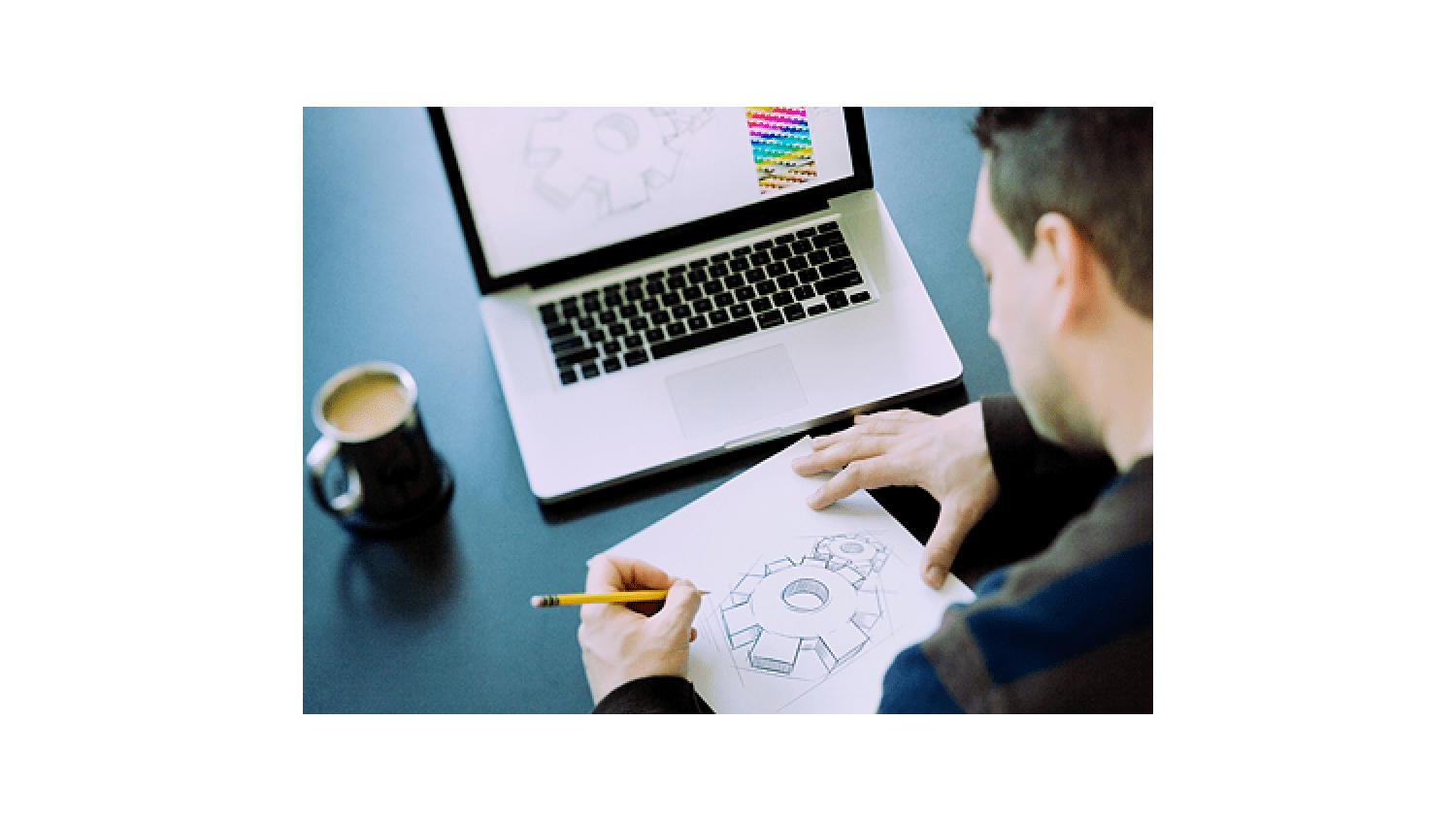
Draw it on paper first
We’ve mentioned in the past that this is standard practice here, but we’ll say it again in case you missed it the first time. When we have design meetings, our designers frequently come to the table ready to sketch out some ideas on paper during the meeting. Not everything is a keeper, but great design comes out of experimenting with different ideas and deciding what works and what doesn’t.
Be a student of everything
It’s wonderful to cruise design blogs for inspiration, but maintaining originality takes a lot more than that. We have to look at everything. The world around us is full of things that can inspire us, so whether it’s watching a fun video or going for a walk to appreciate some great architecture, we’re always looking for inspiration from all kinds of things. The more sensitive we are to the world around us, the more inspired our designs become.
And so GLAD WORKS friends, that’s how we make sure that our design projects aren’t wearing “The Rachel.” We have to have some diversity, and while nothing is ever totally original, we all need to remember that there is a difference between being inspired by something and simply imitating it.

 An agency-eye view of Marketing, Advertising, Branding, Design & Media.
Great topic Kristen. I love looking at old and new trends. Also a good thing to keep in mind when looking at websites designed more then a few years ago, it might be time for an update.
That's exactly right, Mattie. It's really important to keep things looking current!